Styling Work | Modern Farmhouse
Heather Bullard | Styling Work Country Living
Thought it might be nice for another installment of recent styling work. The last six months has seen a fairly intense work schedule and I missed sharing many of the holiday projects that hit newsstands during the season. So we'll just start fresh this year with this modern Alabama farmhouse for March issue of Country Living.
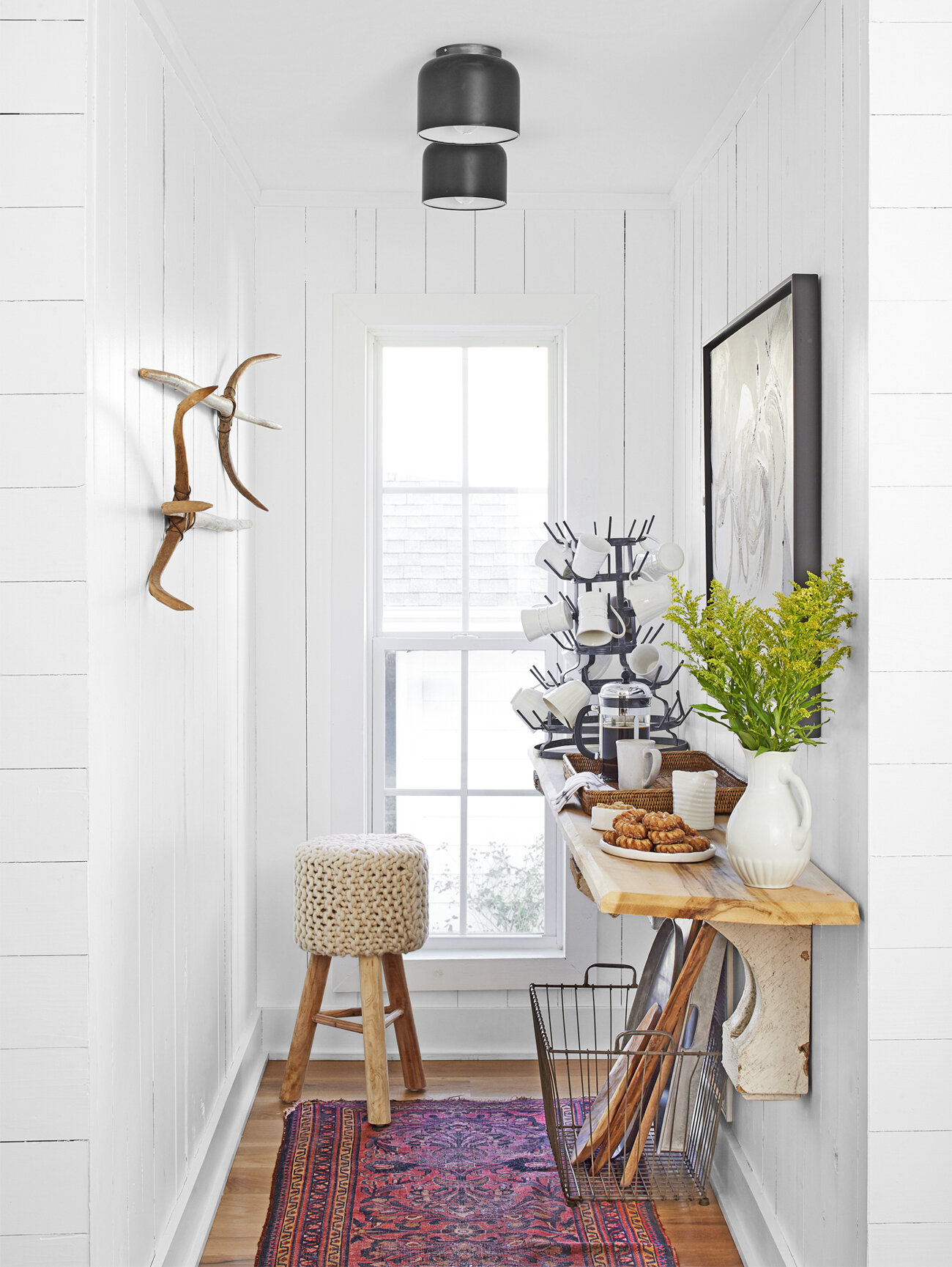
First, we need to talk about this little coffee alcove! Isn't it a genius use of a small space? I would be happy to start my morning here every single day. I kept the styling to a minimum since it was pretty fantastic on it's own. Only adding in the antique rug, fresh florals, and a plate of tiny apple crullers. The homeowners, Paige and Blair Thornton usually keep a Keurig in here but for the sake of editorial beauty I swapped it out for a French press, added a basket tray for warmth and texture and the coffee accoutrements. I love how the black flush mount fixtures add a graphic pop to the space and seriously covet the knitted stool Paige found at Tuesday Morning!
Heather Bullard | Styling Work Country Living
Paige owns a beautiful shop The French Basket and has an impressive array of tabletop items for her bright white kitchen. For the styling I pulled items from her collections, reworked the open shelving a bit and added fresh greenery and produce. I also moved the pedestal filled with oils from another area in the kitchen to showcase it next to the range and filled it with a few colorful bottles of vinegar & oils, fresh herbs and bowl of garlic.
Heather Bullard | Styling Work Country Living
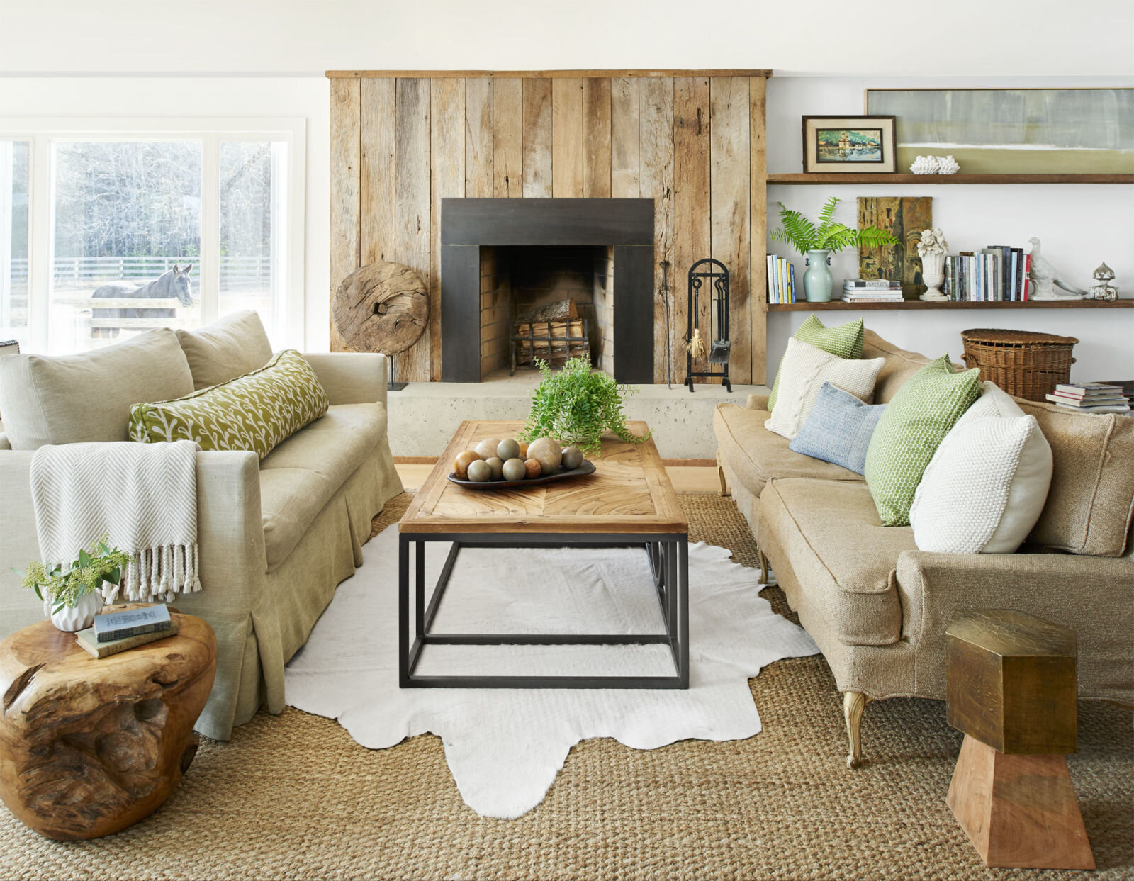
In the living room we rearranged the furniture to open up the view to the fireplace and give visual impact. Paige loved the change and actually kept it this way afterwards. Sometimes it's nice to switch things up a bit! I also reworked the open shelving adding layers of artwork, books, and decorative objects. I pulled in the wood stump and hexagon table from other rooms to use as end tables for the sofas. Of note, this room was styled with practically everything from the homeowners own decor. And did you happen to notice the cameo appearance of their horse Idgy? Let's just say getting him in that position was a team effort including apple bribes and someone laying on the floor under the window!
Heather Bullard | Styling Work Country Living
I always enjoy styling a simple vignette. When doing so, the objects need to stand out individually and I feel this is a perfect example. The gorgeous landscape by photographer David Hillegas sets a dramatic tone and mood and the antler shed and branches enhance the natural feel to the space. Proving that indeed, less is more.
I hope you enjoy these behind-the-scenes posts! You can see more in the March issue of Country Living or visit their website for additional images and interview from the story. Photography by Brian Woodcock | Styling by Heather Bullard | Homeowner Paige & Blair Thornton
Between posts you can find me on Instagram sharing highlights of daily life. And if you'd like new posts delivered to your inbox you may subscribe here!


