The Easiest Styling Trick!
I know that styling can sometimes feel intimidating - especially when you’re faced with an empty shelf, table, or corner, and a house full of collected objects to select from, how do you know where to begin? In this post, I want to share with you how to throw together a quick vignette with just three objects. It’s an easy win that I like to think of as the stylist’s hat-trick!
Let’s break it down. The three items you’ll need are: something tall, something wide, and something small. Bonus points if you can include something organic, something geometric, and something practical in a single vignette!
Before we dive in, let’s talk about vignettes; what are they? A vignette has a few definitions, but in interior styling, it is a collection of a few objects that can stand alone as a unit. It tells a small part of the story, representing the rest of the room on a smaller scale. Now, let’s dive in to some examples!
The Dining Table
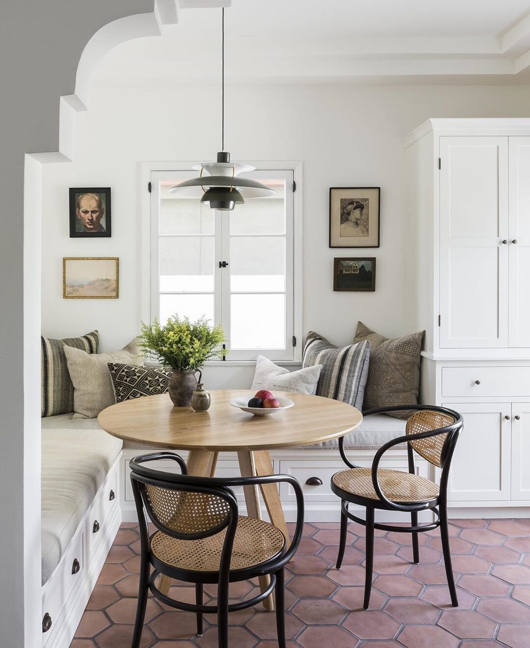
Aside from being super charming, the image below also makes use of the “three-item trick” very clearly. The pitcher of greenery adds height and organic texture, while the bowl of fruit provides a pop of color and a nice wide shape. The smaller ceramic vase acts as a punctuation mark to tie the larger objects together - think of it as a comma in a sentence. There’s definitely a focus on pretty decor but a practical element comes in with the fruit. I also love how the three-item theme is echoed in the fruit itself.
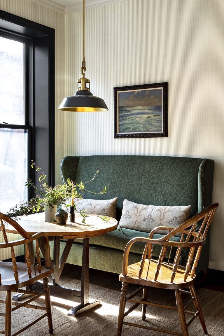
The vignette blow is very similar to the one above, just with slightly different objects! You don’t always need something wide and low like a bowl - what’s important is that the three objects have different enough shapes to stand out from one another. The way the wild greenery weaves through the composition is my favorite part of this scene, and it adds another layer of meaning to the term “vignette,” which has a root word meaning “little vine.”
The Nightstand
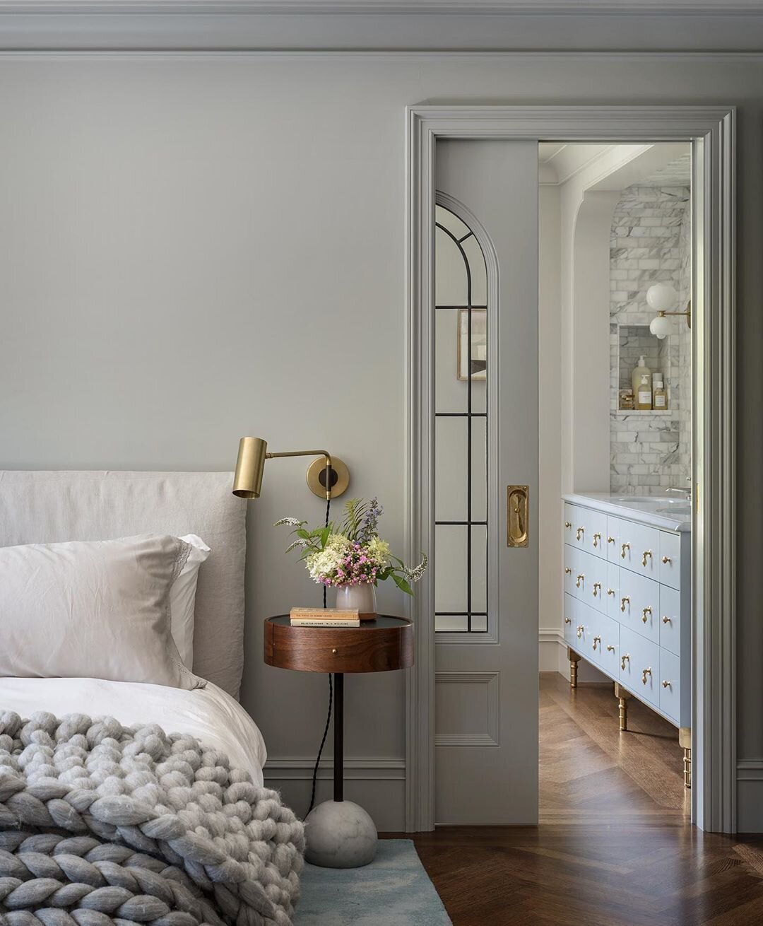
What makes this vignette slightly unique is that the sconce acts as a third styling object. The books ground the composition with a flat, linear element, the floral arrangement adds a much needed pop of organic energy to an otherwise quite sleek space, and the sconce ties it all together. A similar effect could be achieved on your own nightstand with a table lamp if you prefer. What’s great about this scene is it’s mix of styles and textures - it’s modern yet traditional, with a nice combination of geometric shapes and organic textures.
The Kitchen
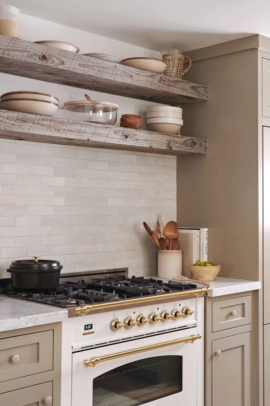
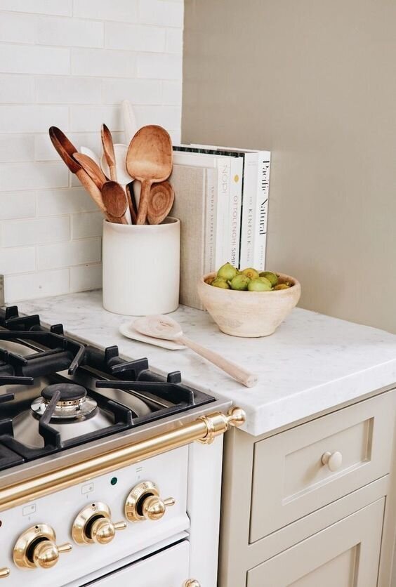
You can’t go wrong with this combination: vase + books + bowl. Add some seasonal produce, an artwork or two and you’re done! To keep it even more practical, use your most-loved cookbooks as styling props in the kitchen so you can easily access them anytime. I like how the fruit bowl is actually a ceramic colander - it adds a little more texture and visual interest.
Greenery in a vase isn’t the only way to add height to a composition, especially in a kitchen. Try a crock filled with cooking utensils or cookbooks stacked vertically. Everything pictured in this vignette is practical as well as beautiful.
The Living Area
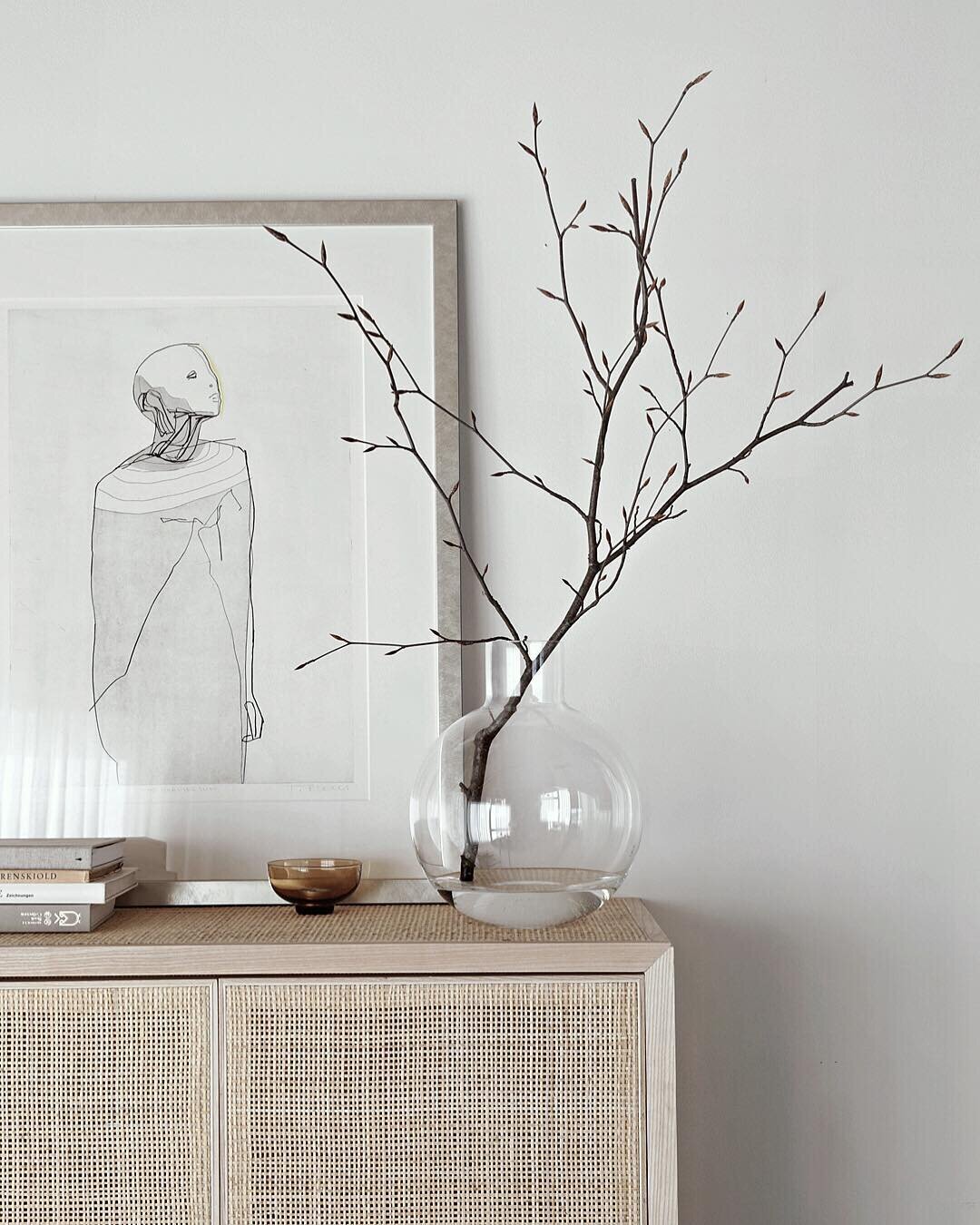
For those areas that aren’t frequently used every single day, like display cabinets, credenzas, or bookshelves, you can feel free to be a lot more decorative and less concerned with practicality. I love the stark sculptural branches in the image below - they provide an organic element but remain minimalist to compliment the rest of the scene. The use of rounded decor pieces (vase and bowl) contrast nicely with the geometric edges of the cabinet and frame.
I hope this gives you a little more confidence when styling spaces in your own home! The great thing about the three item “hat trick” is that achieving it can be done with items you currently have in your own home. Once you grasp the concepts, take a walk through your spaces to see what you can use to style your own beautiful vignettes!
Photo credits in order: Amber Interiors, Kathy Hodges Design, House Beautiful, Jessica Helgerson, Light & Dwell, Jenni Kayne, Stylizimo

