Styling Essentials: Whiteware
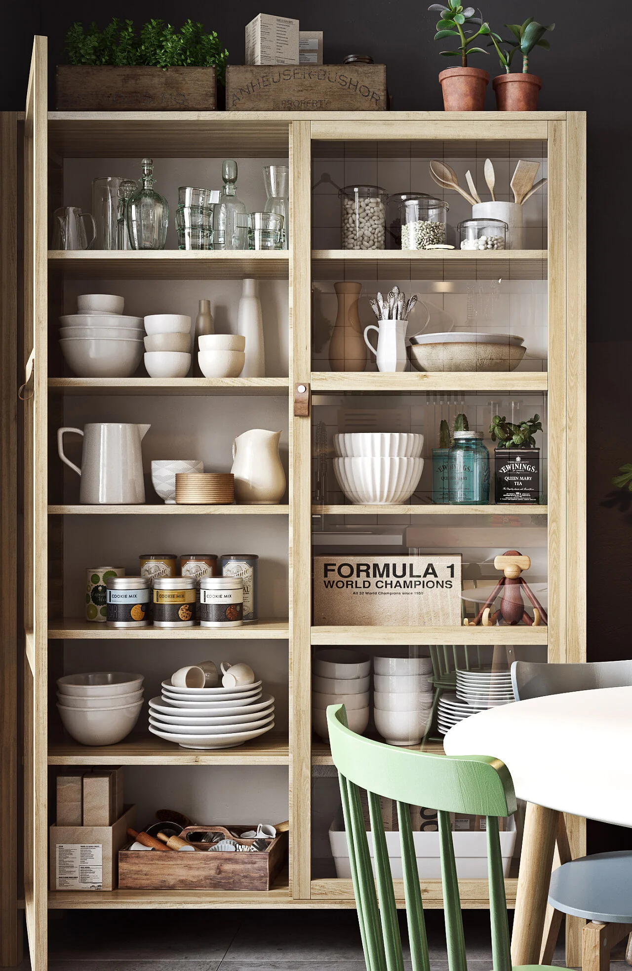
Welcome back to another installment in our series Styling Essentials, where we talk about the decor items I source most often for photoshoots to help make a space feel layered and beautifully styled. These styling essentials are the pieces I find many homeowners often don’t have enough of - or at all. In today’s lesson, we’ll discuss a fundamental building block when it comes to styling a kitchen or dining space; whiteware. There is something so classic, clean and uncomplicated about styling an all white display, but whiteware also helps to balance more colorful or patterned collections. There are a few elements I keep in mind when styling whiteware: Sculpture & Scale, Visual Height, and Form & Function. Now let’s dive in!
SCULPTURE & SCALE
When assembling your display with whiteware, you’ll want to be sure to include larger scale pieces and items with a unique or bold shape. These types of strong, eye-catching pieces can stand alone and will easily and quickly fill up space in your cabinet or shelves. Using larger scale pieces will help prevent common mistakes I see often which are; too many small items, or ones that very similar or the exact same size. Incorporating sculpture and scale in your styling, also gives you the ability to create dimension and a composition that is difficult to achieve using an array of like items.
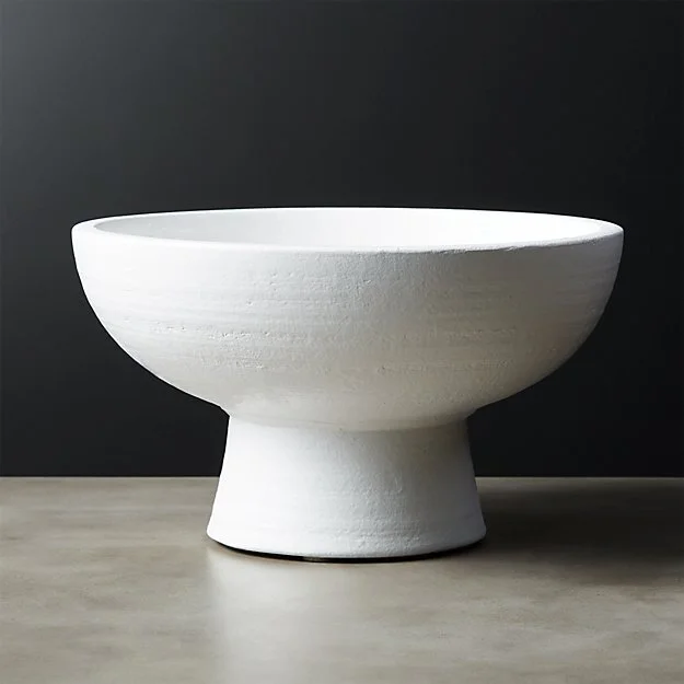
I love the minimal sculptural shape of this modern bowl. The combination of surface texture with a pure white shape make it more unique than your typical whiteware.
You can find some amazing sculptural bowls from potters around the world - this one and this one are both incredible. I have an affinity for handmade pieces for their unique texture and imperfect shapes.
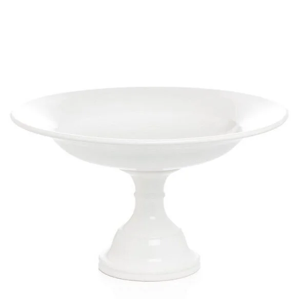
The traditional curves of this large footed bowl would add a lot of visual interest to a display of whiteware. This one is top-heavy, making it a great balance to something that is wide and low, such as the serving bowl below.
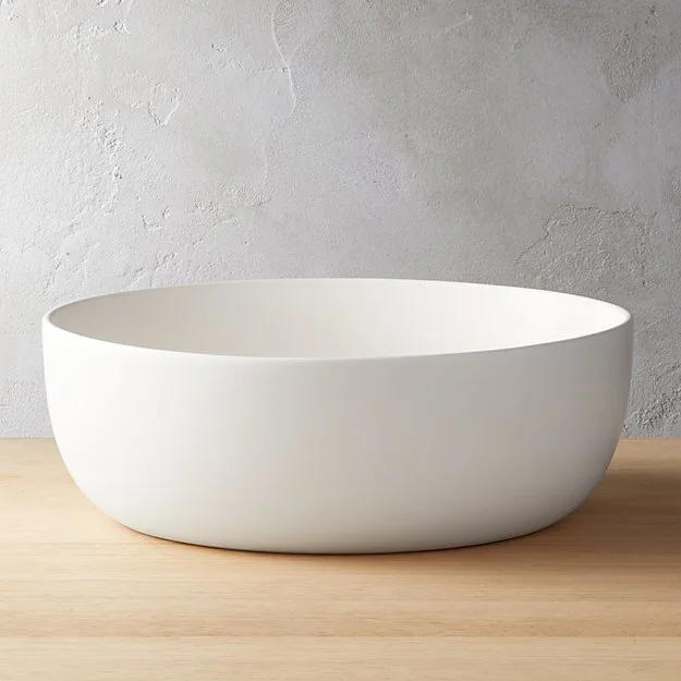
The low and wide shape of this bowl would provide a nice grounding presence in a display. When used on a kitchen shelf, fill it with towels or napkins for a layering element.
VISUAL HEIGHT
When styling a shelf or display you want to think about filling in vertical space as well as horizontal. You want objects with a variety of different heights so that the collection as a whole looks dynamic and layered rather than one note or flat. Here are three ways you can accomplish that with ease!
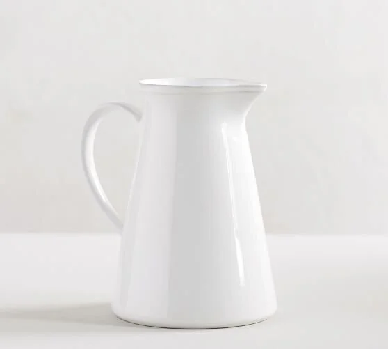
Pitchers are a great way to add a vertical height element to your display. The handles also incorporate a linear element, which adds even more visual interest to your composition.
Other great options - this organic shaped one or this affordable classic style.
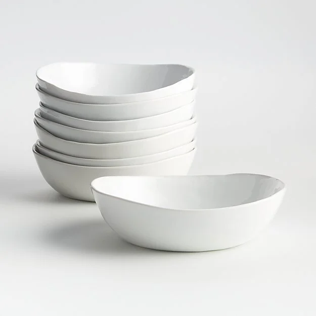
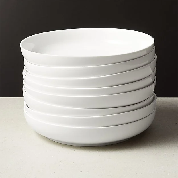
Adding stacks of bowls or plates is one of the easiest ways to build up height in your composition. Try thinking outside the box with unique shapes like these sculptural bowls.
What’s great about creating stacks is that you can easily alter the height. If you need the stack to be a bit taller to offset a small object nearby, just add another bowl or plate!
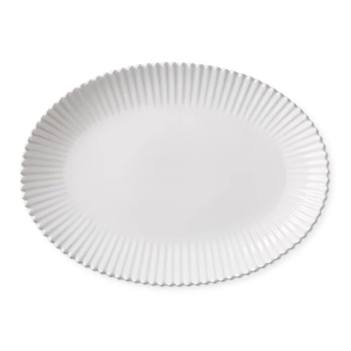
Platters are the perfect unifying backdrops when propped up behind other objects. They add a sense of depth and abundance to your composition which is naturally more appealing to the eye. If the tray has a unique shape or interesting details, it can certainly stand alone as a sculptural object.
Other favorites: this large round platter, this organic oval shaped one, and this classic style!
To help keep propped platters and trays from slipping, I secure it with a small piece of museum putty.
FORM & FUNCTION
I always suggest keeping practical, commonly used items within arms reach. By keeping everyday dishes or most used items on the lower shelves your styling will feel more authentic to how you use the and function within the space. Here are examples of utilitarian whiteware items that are best kept handy!
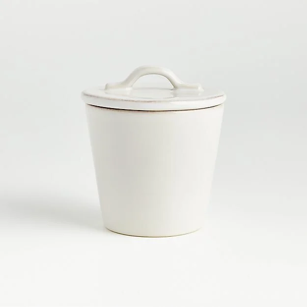
This sugar canister is great if you enjoy a sweet coffee or tea, but you can also put salt or your signature spice mix in it. Canisters are a workhorse in the kitchen and can be used to store practically anything!
I’ve also sourced some beautiful handmade canisters for you here and here.
Cups & Mugs
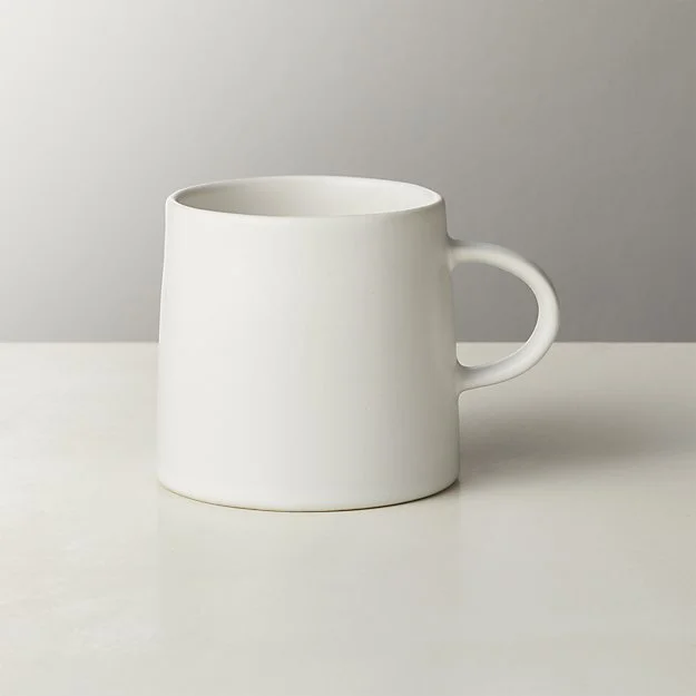
I’m very fond of these matte white espresso cups or these cups with saucers! Both can easily stack together to create height on a shelf, or try my trick of placing a small breadboard between a collection of cups or mugs for even easier stacking!
Everyday Plates & Bowls
The world’s best chefs often say that food looks better on white! My favorites are large serving bowls or shallow plates and I include them in my editorial styling quite often.
I own 3 sets of these appetizer plates, but I also like the wide and low shape of these pasta bowls, and these salad plates.
I hope this gets you excited about all the possibilities of whiteware! Use this as a reference guide and take time to go through your own cabinets and cupboards to see what you whiteware you may have on hand to practice your styling! You can also find more specific tips about styling open shelving with my free download here: 5 Steps to Perfect Open Shelves. Feel free to leave any questions you may have in the comments below. I’m always happy to connect with you!
Photo credit: Mini

