How To Be Inspired | French Greenhouse
I want to talk with you about something that's been on my mind for a while: the difference between inspiration and imitation. I feel that over the last few years, the prevalence of Instagram and Pinterest “inspiration” has altered our idea of what it means to actually be inspired. As a location scout for magazines, I've noticed homes becoming more and more identical online, lacking individuality and becoming carbon copies of what's trending. And, although it may seem easier to copy exactly what you see online, the results will inevitably lack depth and personality.
Today, I want to show you how you can use inspiration images as a springboard rather than a blueprint. Instead of sourcing identical items, we will focus on things like: quality of light, texture, color hues, the sense of history or place, mood, and experience. This is how the world's best artists and creative directors approach inspiration, they use the world around them as a living mood board of elements to pull bits and pieces from. They use inspiration to innovate, not replicate.
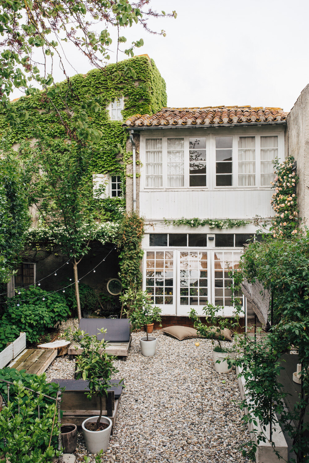
Last year I spent a solo month in France and rented this gorgeous greenhouse apartment. The location was very inspiring and I thought some of the photos I took there would make for a great discussion on the topic. I want to walk you through the process of how you can be inspired by this particular space as opposed to duplicating it exactly.
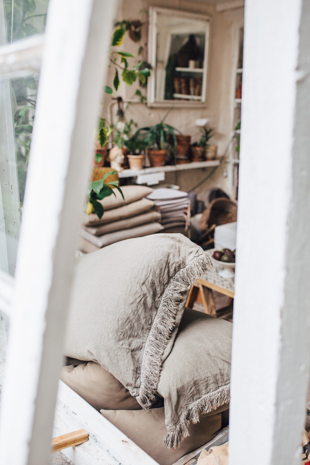
In this image, I am most inspired by the wabi-sabi nature of the space. I love how the room feels randomly tossed together, but all the elements work collectively to create a rather beautiful mess. Nothing is too perfect, shown in the wrinkled fabrics, aged plaster and terra cotta finishes. The abundance of soft natural light and greenery make it feel very fresh and seasonally, it feels like Spring. It’s the perfect mix of indoor and outdoor and I can easily imagine hiding away there with a good book and a cup of coffee while morning light streams in through the windows. Let’s see how might we reinterpret this inspiration:
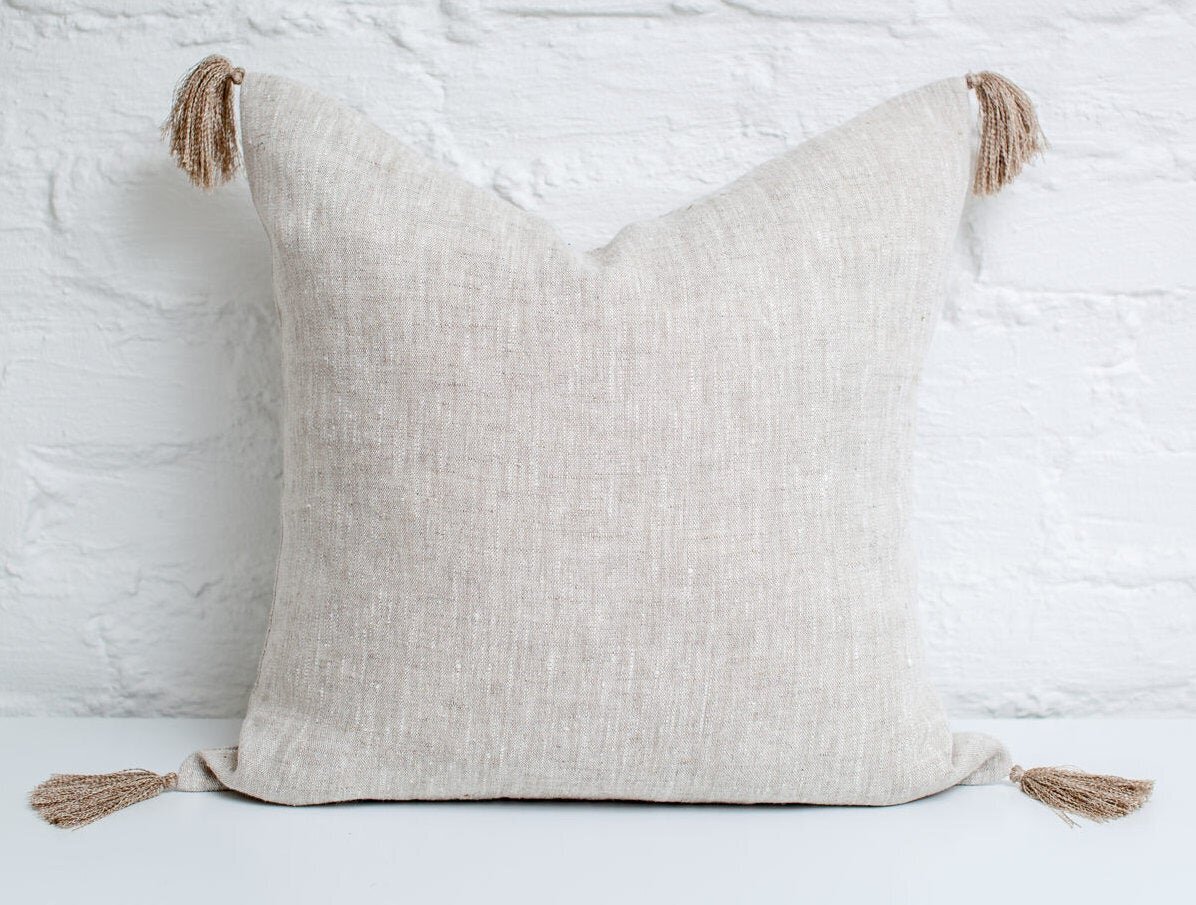
There’s nothing wrong with pulling similar items from inspiration photos, but keep in mind that they don’t have to be exact copies to look great in a space. The feeling we're aiming to capture is effortlessness; any natural linen pillow with or without fringe will convey the right mood.
The trees and plants in the greenhouse could be interpreted in a different way, through artwork. This still life echoes the the lemon tree in the inspiration image and the worn vintage feeling evokes the age of the greenhouse.
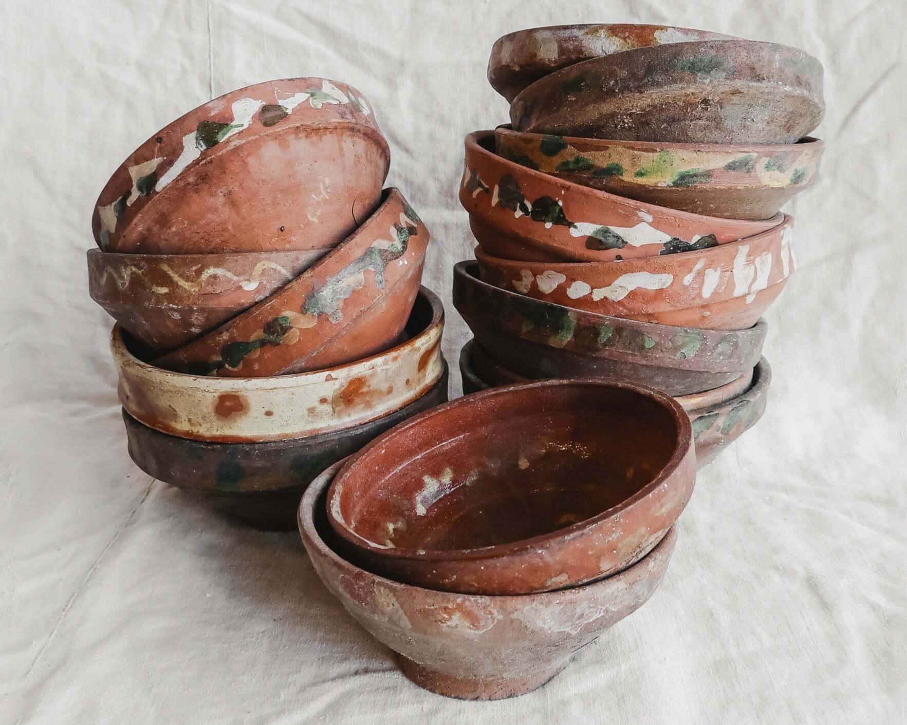
Antique hand painted bowls pull in the worn texture of the terra cotta pots in the background, while the little pops of green paint relate to the greenery in the room. Being vintage, these also have the same sense of history and age that makes this inspiration room so lovely.
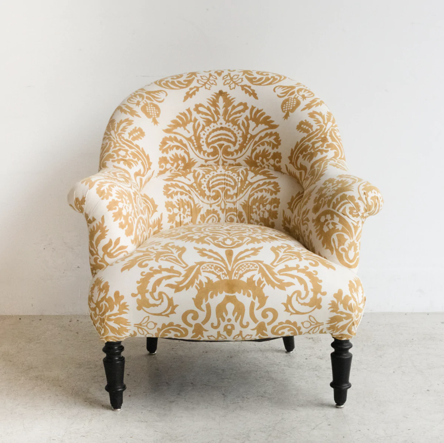
The element I’m really drawn to here is the accent chair. This could easily be re-interpreted for its pattern, color, or velvety fabric texture. I also love that the chair in combination with the little marble sculpture give this image a very European feel.
The tones of this newly refurbished French chair feel very similar to the greenhouse color palette and the playful oversize pattern is a nod to the one on the velvet chair.
The gradient ochre hues of this pottery mirrors the tone of the chair perfectly and the glaze drips are very wabi-sabi. Because it was sourced from a flea market in France, it also pulls in the European look we see in the space.
The pattern of this antique inspired rug reflects those found in the chair, while the olive and ivory colors blend harmoniously with those found throughout the greenhouse.
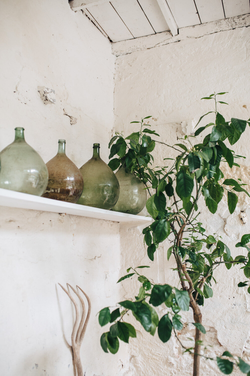
What I love most about this image is the mix of aged texture combined with a sense of minimalism. I also love the fresh color palette of off-white, taupe, and green. This could be reinterpreted through the textures, colors, raw wood tones, or by incorporating colored or handmade glassware.
This handmade wool pillow feels much like the plastered stone wall in the inspiration image, having the same variation in color and texture. It's also the perfect representation of minimal design through the tone on tone weave.
The distressed wood on this chair pulls in texture referenced from the lemon tree and garden fork, while the olive green color is a nod to the variation of hues in the glass demijohns.
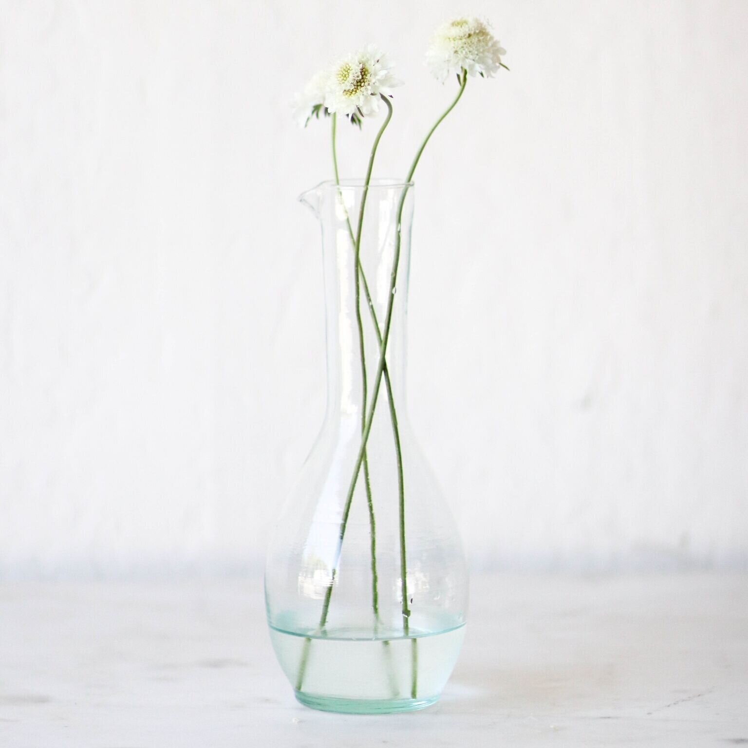
The subtle color and imperfect nature of hand-blown Moroccan glass echoes the old world charm found in this space, while the style gives the same sense of simplicity.
I hope this encourages you to begin thinking about exactly what it is that captures your attention when looking at inspiration photos. Instead of approaching it as a means to duplicate the space literally, take time to reflect on the individual elements that attract you. Is it the mood, the color palette, the patina or sense of age within the space - focus on those things and spend time considering how you can reinterpret those aspects in order to create your own authentic style!
The Collected Kitchen
If you enjoyed this post, there is a second one in the series. How to Be Inspired: The Collected Kitchen

