Styling Work | Small Spaces: California Ranch
Heather Bullard Styling | California Ranch
The September issue of Country Living is our Small Spaces issue. It's one I look forward to every year because I'm fascinated by folks who scale back their home size, pare down belongings, and live in petite places. Have you ever watched Tiny House Nation? Obsessed.
I thought it might be fun to share how I styled each space within this 1,143 sq.ft. California ranch and give you some tips for using the concepts in your own home.
The home belongs to Mike and Jennifer Maxcy of The Ranch Uncommon. She has amazing taste and made my job easy - and fun because she has such a warm and friendly personality and was open to letting me rummage through her belongings for props. Since the shoot we've hit the flea together looking for hidden gems and I hope we get to do it more often. Here's how the rooms came together style wise...
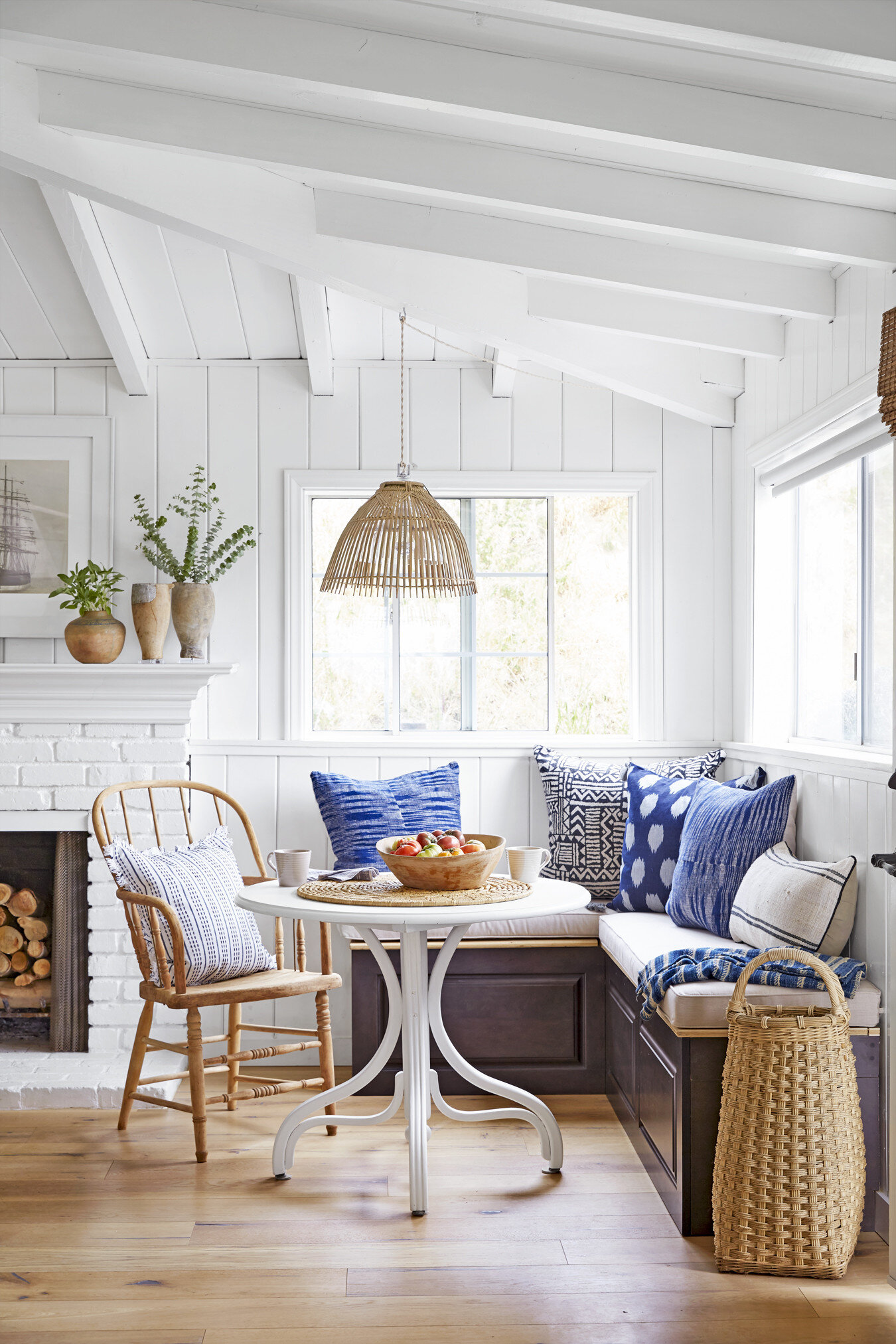
Dining Nook - I layered the bench with a mix of pillows in different patterns, indigo hues and textures. The mix adds depth to a space with very little investment and can be done in almost any room. Since this was for a Sept issue I wanted the table to have that "end of summer" feeling so I piled an antique wooden bowl with heirloom tomatoes. Tip - Centerpieces don't always have to be floral; be creative with what you have on hand. To keep the moment casual I added coffee mugs and a linen napkin - for a "just in from the garden coffee break".
Heather Bullard | Styling CL Sept16
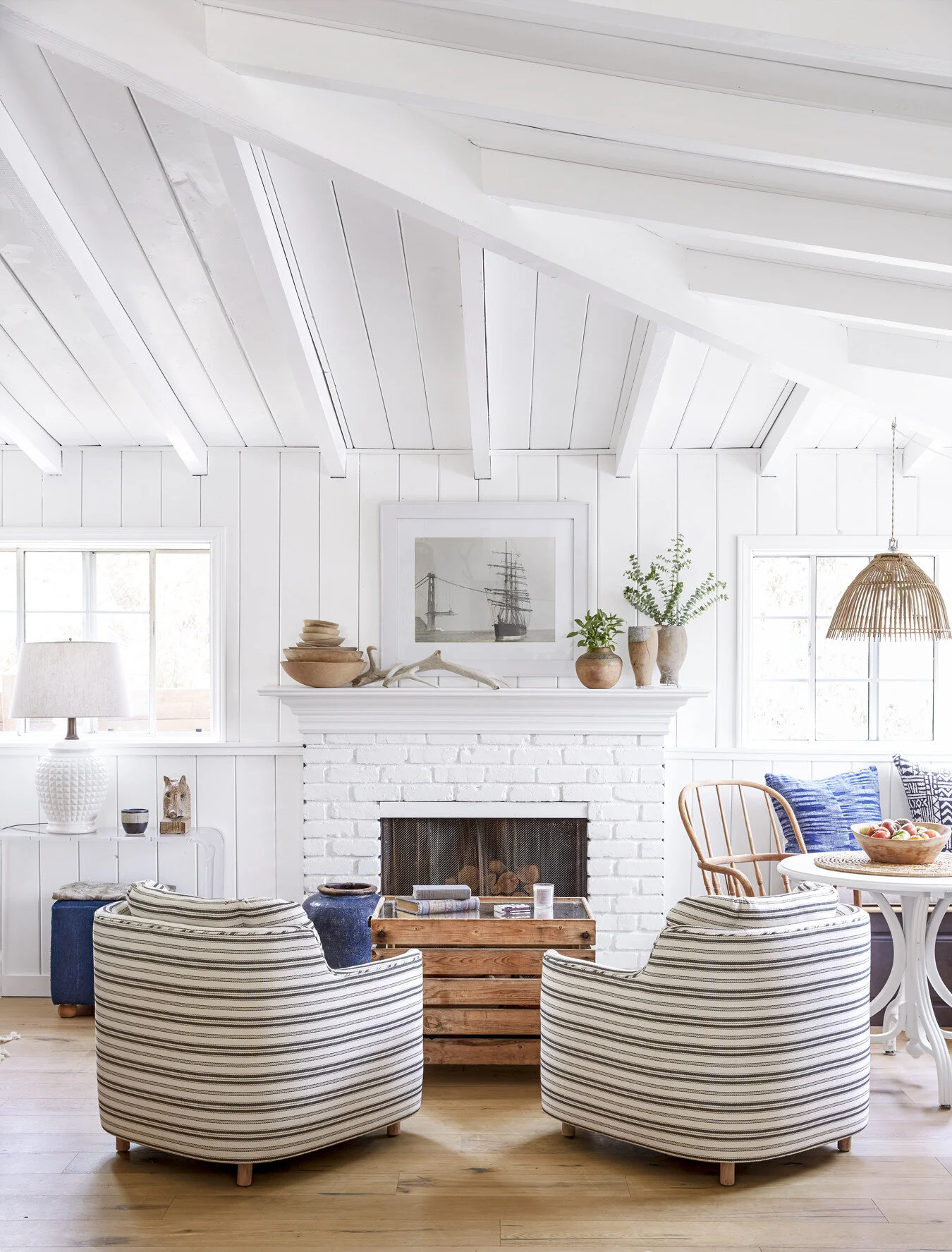
Seating Area - Since those amazing chairs are the focal point, everything else was kept simple. On the mantle, I added a stack of bowls from Jennifer's collection and a mix of wood and pottery vases. Just a few sprigs of greenery draw the eye up and add a bit of color to the neutral space. Placing the antler sheds off center tie the mantle pieces together without blocking the black and white ship photograph.
Heather Bullard Styling CL Maxy1
Kitchen - I reworked the dishes on the low shelf and pulled in the blue pottery. Several pots of herbs, the bowl of artichokes, the vase filled with variegated greens and the baby cactus on the windowsill help the kitchen feel fresh and vibrant. I placed a few tea towels in one of the clear glass canisters on the back counter. Tip - They don't always have to be filled items from the pantry as long as they relate to your kitchen. Try cookie cutters, antique tart molds, boxes of matches, or piles of candles. Of note: I used two mismatched runners that blended well together and we turned the island around in order to show off the hardware!
Heather Bullard Styling CL Maxy4
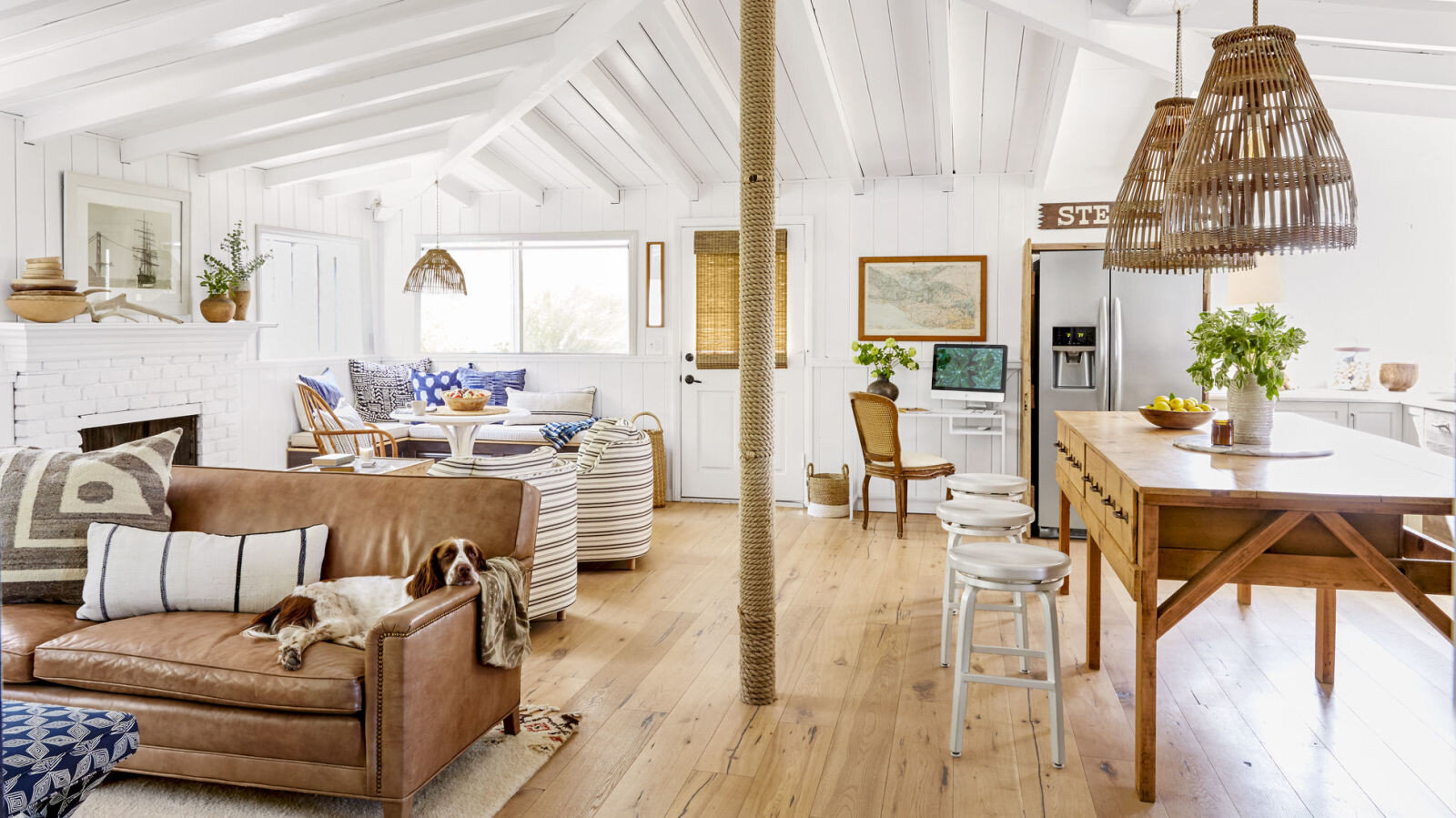
Here you can see how the open concept works so well with each area having it's own space. I think Jennifer did an amazing job with the spacial planning. She even carved out room for a little office between the door and refrigerator...genius!
Heather Bullard | Styling CL
Living Room - Again, great use of space with the small storage nook. For the styling I reworked the firewood (yes, I do that!) folded blankets and textiles in varying textures and colors, and added a stack of Jennifer's books. The pillows and throw were kept neutral so the nook would be the main focal point. A small plate of tea and cookies make the space feel cozy and inviting.
CL Cover Sept16
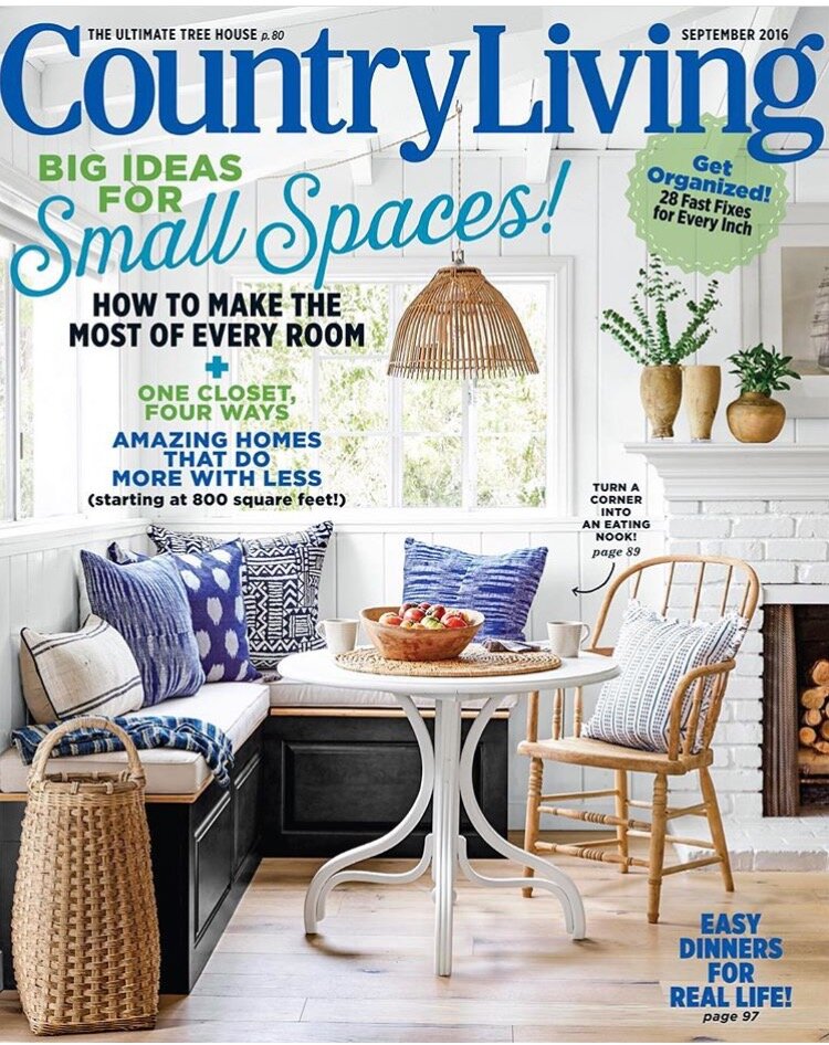
If you'd like to see more of this home or get ideas from other small spaces, pick up a copy of the September issue! Photos - Victoria Pearson | Styling - Heather Bullard | Home - Jennifer Maxcy
I hope you enjoyed some of these behind-the-scenes tips. If you have any questions, please leave them in the comments. I'm happy to help and I'd love to hear how you add style to your own small spaces.
PS. You may have noticed my site has a fresh new look! It feels good to spruce things up a bit. If you'd like to have new posts delivered to your inbox sign up here. And if you'd like to add the blog to your reader service visit here.


